Tuesday, May 22, 2012

More than wayfinding…

When towns or cities recognise they have a need for wayfinding, usually because they discover that visitors are lost or that destinations are being underused their first reaction is to install signs. This is however not surprising, wayfinding is after all a point to point navigation exercise, and signage is the most obvious and visible tool to undertake this task.

While signage can be an important part of a solution, this view of both the objectives and
limitations of a wayfinding system will limit its potential benefits and outcomes. An effective system will actually consider much more than just signage, and if done correctly, it will have benefits that go far beyond simply helping people find their destination, and so a good wayfinding is actually part of a wider information system. An information system is a integrated set of visual and physical components for the communicating and delivery of wayfinding and interpretational information.

A holistic approach to wayfinding will look at every possible point of contact with a user of the information system, from the time they begin contemplating and planning their journey through until they reach their final destination and beyond.

The result will be something more than just an effective wayfinding or signage system. It will actually play a leading role in shaping the overall user experience, which is a critical component in creating strong sense of place and identity. 


Wayfinding is much more than signage.

Friday, October 28, 2011


Designing in a complex world

A trip to the local pub never fails to provided a full and lively array of discussion topics that would never normally be debated outside of its four walls and this occasion was no different. Only last week I discussed the last taboo in swearing with a few members of the Wayshowing Group at our monthly meet-up, how we came onto this topic I can't tell you. (I'd like to point out it was not because of alcohol, its just I cannot remember the sequence that brought us to that point!)

Anyway, I've digressed from the image above. At face value to many the image could have been drawn by a small child however, it was actually constructed by two fully grown men both design professionals. The 'diagram' is trying to convey the USA and its cultural areas, at first we thought this would be a relatively simple task each of us had our own clear understanding. We didn't agree!

It wasn't the amount of areas of even the description, it was how we physically defined them on the paper. My argument was that it wasn't as straight forward as clearly dividing up the landscape like a political map, as with many things cultures merge, integrate and overlap. My approach was to define the areas in a more loose approach, I was quickly knocked back as being indecisive and identified as a typical 'Design Strategist'.

However it made me think, the graphic designer just wanted to make a decision, define the boundaries and get on with making a beautiful info graphic but, whats the point!? What would have been produced would of undoubtedly been beautiful but not very useful, I think it goes to prove that 'Design Strategists' as a important part of the design process and time should be taken to research, understand, analyse, rethink and question what we are doing. Too many times stuff is just produced and sent out into the world without thought and this can be linked back to a previous post of mine 'Information Design in a complex world'.

Sunday, July 17, 2011


A love affair with books

I have recently rediscovered my passion for books, when I say rediscovered it’s not to say I fell out of love with them rather stopped buying them!

My modest collection has begun to grow once again and I have found myself browsing for new and interesting titles at every opportunity. My latest acquisition is the ‘Atlas of Remote Islands’ by Judith Schalnsky a renowned author and graphic designer. (Until this book unknown to me.)

I came across the book during a regular browsing of the shelves at Foyles on the Southbank. I often like to visit the shop and cast my eye over it’s offerings many of my recent purchases have come from here. It’s funny how I never go in with a book in mind; I seem to treat the shop as a inspiration centre, I mean why would I buy a book on Small Islands; I’m not a geographer!

The book is stunningly beautiful, on one page there are perfect maps you can’t can help but stare at in awe and on the other are bizarre stories from the history of the islands themselves. The book transports you into a world you can’t wait to become a part of, “fifty islands I have never visited and never will” is written on the front of the book but just maybe I’ll get to visit one.

“Tenderly tracing one finger over the maps, we lose ourselves in the beauty of filigree lines, points and letters. We smell the sea, hear the surf breaking, see icebergs and rocks and under our feet feel fine sand. Anyone who opens this, the most enchanting book of the autumn, is likely to get as lost as Robinson Crusoe for a while.”
(DIE ZEIT)

“an utterly exquisite object ... her book makes a magnificent case for the atlas to be recognised as literature, worthy of its original name - theatrum orbis terrarum, "the theatre of the world".
(Robert Macfarlane, The Guardian)

I’m sure you’ll agree very compelling reviews, and for myself it’s an object you want to just own and treasure and luckily I can now do both.

Friday, April 08, 2011

Information Design in a complex world


The world has become an increasingly complicated environment because the information describing it has grown at an unchecked and uncontrollable rate in terms of circulation and size. This has been compounded by rate of the digitalisation, which has impacted on its transparency of the information. The traditional tools used by designers for interpreting this and intervening in it are no longer sufficient; therefore the methods that we use to teach students are also no longer sufficient.

It is the tools that are being used that are letting the students down, the way they think and approach a problem is not developing. Collaboration with outside agencies and business is imperative, but the process needs to be structured and must start at the core, with the institutions that teach them.

I am a strong advocate in this having been the product of this process; education can often feel like a protective bubble closed of from the outside world. Now working in one of those consultancies I can understand why this lack of communication and collaboration has been allowed to happen. There is a precariously poised balance between money and time.

The aim should be to teach students to intervene in this complex environment by developing new design tools – soft and hard, rather than focus purely on the redesign of an object or service. This process can’t be narrowed to a single design discipline. It will encompass all, graphic, interactive, product and digital. The time when someone could call themselves a ‘graphic designer’ or a ‘product designer’ has long gone, we are now all multi disciplinary. As with any new idea the cost of implementation may be great but the long-term outcomes are priceless.

Information Design is a focus on the development of strategies, technologies, products and services for mapping out of and understanding a fast developing and complex world. Designers will need to evolve to have a chance to play a role a new meaningful role in an increasingly complex world. This new role will be demanding on the designer’s expertise and analytical, aesthetical and communicative skills.

Tuesday, March 15, 2011

A recent trip to Newcastle proved to be a amusing signs gold mine! When Pictograms go bad! A arrow can now be used as a unit of distance!? I can't see anything listed below!


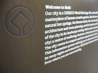
A new information system for the City of Bath I helped to create. The pilot scheme is now in and more is on its way including a complete redesign on the transport information system and a wonderful hand held map. Take a day off from the city and go and check it all out.


Sunday, February 20, 2011

I've recently been working on a project to create a new brand and to help the client understand, I began to write a glossary of common words which they will hear more and more often. This made me think, if you search a traditional dictionary many of these things don't have a definition and if they do, they differ, a lot! Brand is personal and so is its development and construction.


Glossary of terms

Brand Strategy
A framework designed to achieve the desired approach for promoting a brand, relating to its construction.

Brand Architecture
The structure of brands within an organisation. It is the way in which the brands within a company’s portfolio are related to, and differentiated from one another.

Brand Experience
The sum of all points of contact with the brand, culminating in a psychological image created within the minds of people, consisting of all the information and expectations associated with a product, service or the company.

Brand Identity
The outward expression of a brand, including its name, trademark, communications, and visual appearance. The brand will seek to bridge the gap between the brand experience and the brand identity.

Visual Brand Identity
The visual Identity is the sum of all the visual elements used by the brand, the symbol, the colours, the type face and their applications.

Brand Essence
The way of articulating the emotional connection and lasting impression of the brand through one simple statement or phrase that defines the qualities, personality and uniqueness of a brand

Brand Values
The essence of a brand distilled into a series of key words.

Brand Promise
The vision of what the brand must be and do for the consumers translating into a promise for what a brand stands for in the simplest format.

Brand Positioning
Positioning is the process by which a brand creates an image or identity in the minds of its target audience.

Thursday, November 11, 2010

Urban Design Study
Urban Design Strategy
Masterplan
Urban Realm Strategy
Urban Strategy
Urban Vision
Design Strategy…

Call it what you like the list goes on, but how do we go back and ‘constructively critique’ what has been done to see if we achieved the objectives that are so easy to write, if at all?

The Farringdon Urban Design Strategy:
‘The study aims to set out strategies and recommendations for how to integrate a high-quality public transport interchange within Farringdon, and how to increase capacity within Farringdon in terms of public space and new development.’ http://www.lda.gov.uk/projects/Farringdonuds/index.aspx

and…

Six urban design objectives were identified and agreed:

•Make Farringdon more Farringdon.
•Increase synergy between uses, places and stakeholders.
•Create an integrated public transport interchange and movement strategy.
•Make the most of the public realm.
•Make the most of new development and uses.
•Make Farringdon more sustainable.

Make Farringdon more Farringdon, what does this mean? How can you be sure if this has been achieved? Who’s the person/s that will assess this, judge and tick or cross the box depending on their findings what ever they may be?

I’m as guilty as the next person for writing what some would call ‘inspirational goals’, its easy to write them: Make London more London, does this mean more iconic black cabs, red telephone boxes and poor transport infrastructure!? Well I suppose it depends on what London means to the individual! My perception will differ wildly from a visitor, resident or commuter, so perhaps an object such as this is personal?

Make Farringdon more sustainable a reasonable objective and one that could be easily measured if your definition of sustainability is recycling or energy efficiency. I suppose what I’m getting at is, its easy to write a sound bite, harder to deliver it.